OpenComps received a fresh new look today. Long time in the planning, we wanted to celebrate our 20th anniversary and give us a fresh new modern look for the year ahead. We hope you like it.
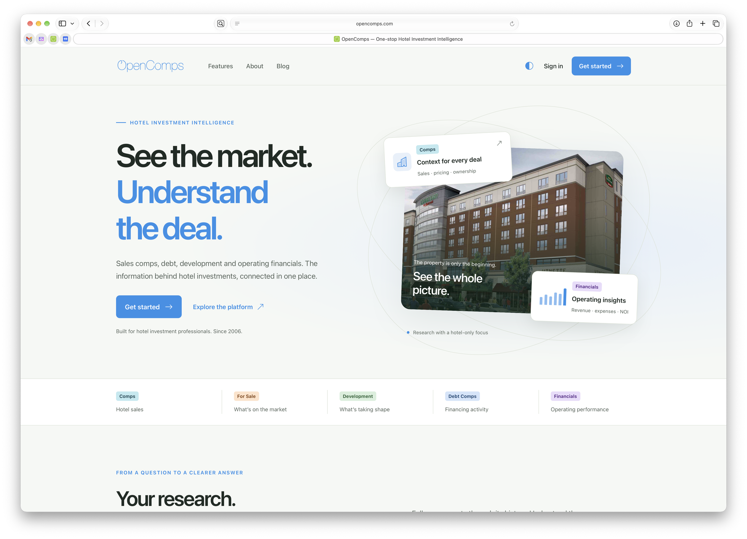
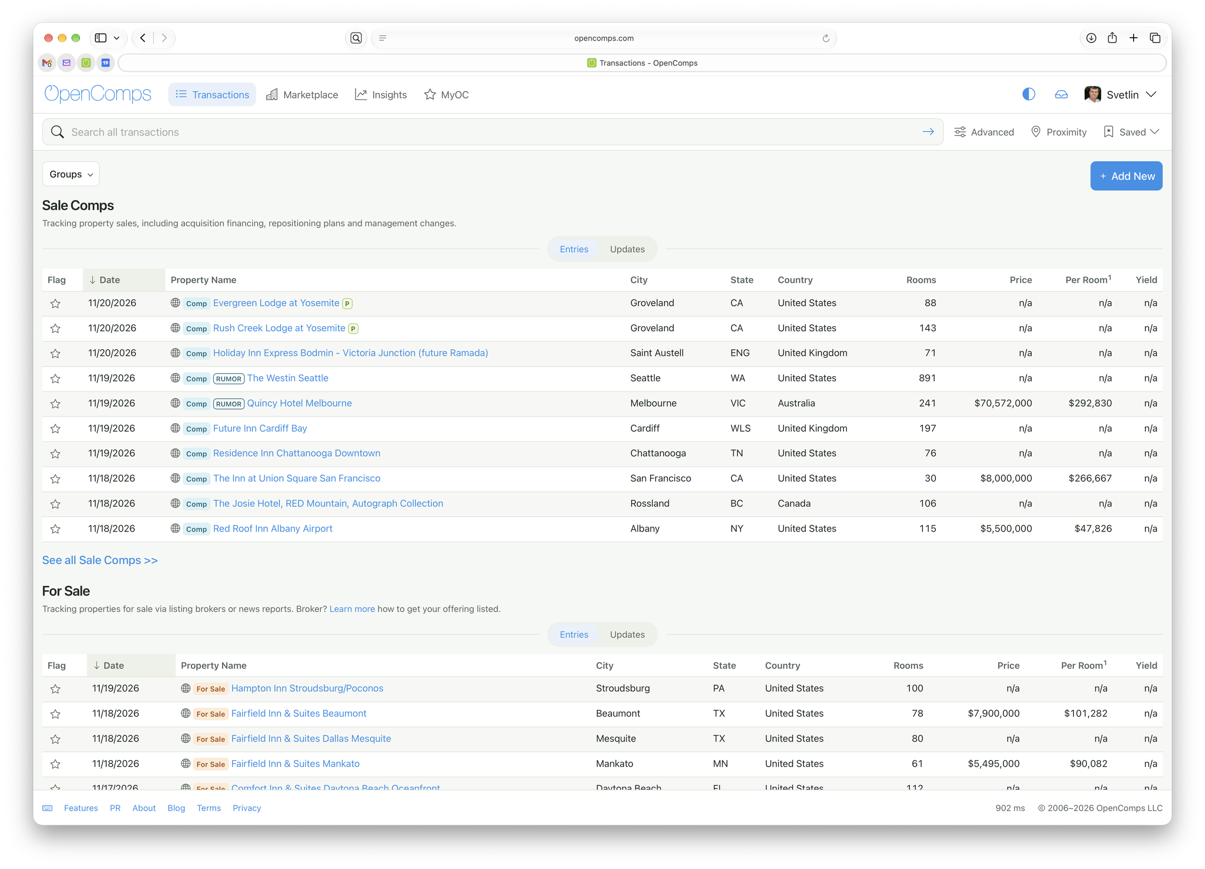
We understand that a change of a productivity tool can sometimes create confusion. We worked hard to make sure everything is just as it was... but better.
Because it is not just a new coat of paint. In fact, OpenComps has undergone a dramatic technological update over the past two months, even while we kind of looked the same. The modernization was aimed to improve the look but also the speed and functionality of our service. Things load faster, they are more organized and hopefully look better.
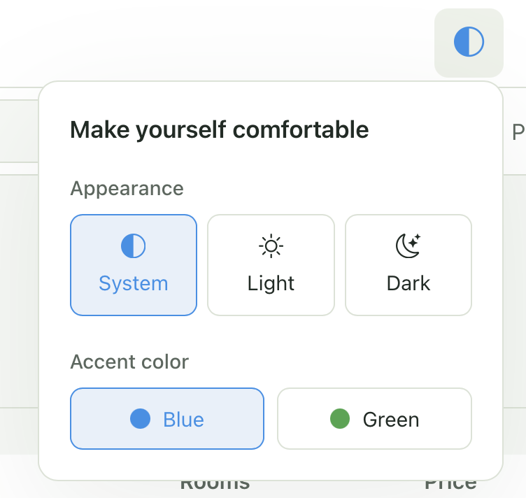
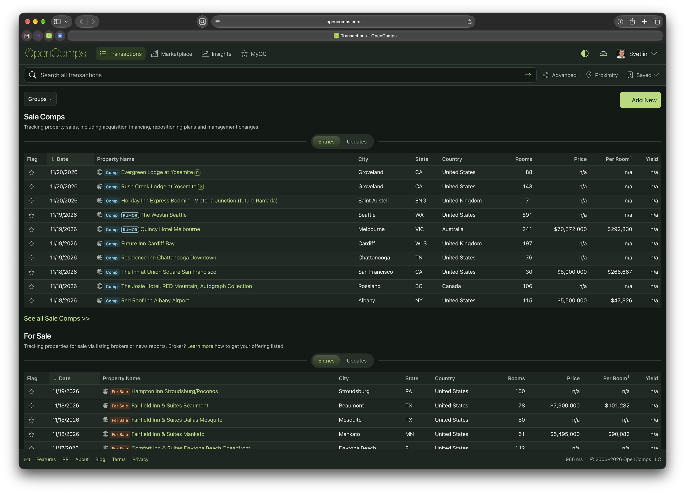
To make you feel at home, we are now offering partial customization: you can choose light or dark mode or align with your system preferences. Also, you can choose two accent colors: blue and green.
We are biased, but we think the dark mode in green, looks amazing:
We have few improved sections like a brand new Mailbox, but also touched up Insights and MyOC.
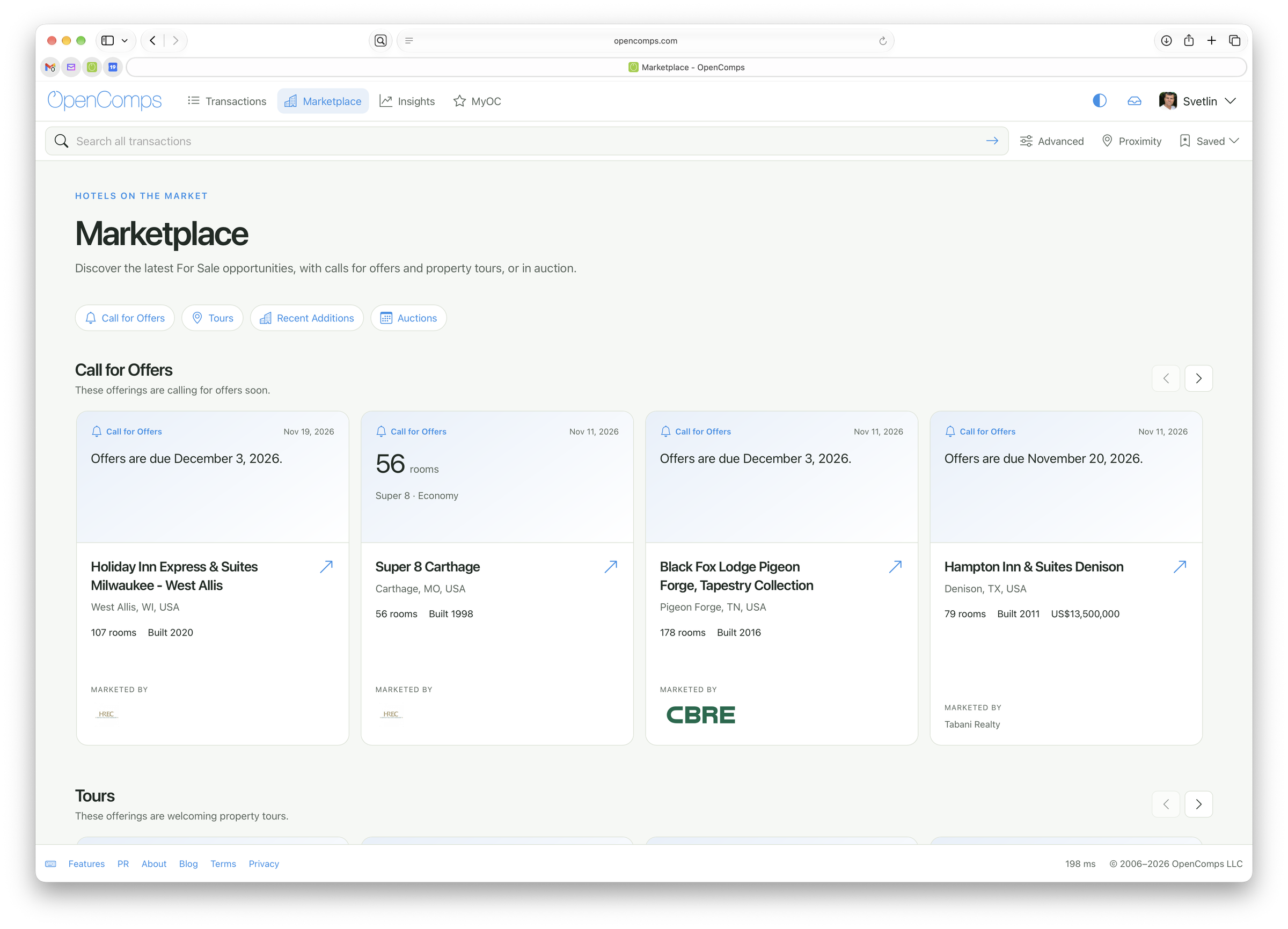
We also have a new section called Marketplace that provides a quick view of the latest For Sale entries and updates just in case you want to quickly browse what's new. Of course, most people rely on search to zero-in on specific market or area and that continues to be the best way to organically see what is on the market alongside what has traded or is being developed.
We look forward to your feedback. Thank you to all the PRO subscribers that support us. If you are not currently a PRO subscriber, we hope you find us useful and decide to become one.